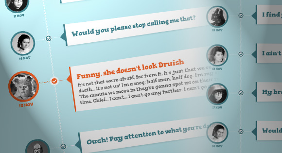
A tutorial about how to create an experimental CSS-only timeline with a 3D effect. The idea is to expand a content area when the associated radio input is selected.
In this tutorial we are going to experiment with perspective and use a radio input trick to create a fun css-only timeline-like structure. The idea is to show a teaser of an item and when clicking on the associated radio input, the content will expand and rotate in 3D, giving some depth to the whole thing. We’ll be using CSS 3D transform, transitions and sibling selectors.
Also note that the 3D effect looks best in WebKit browsers. Unfortunately, Firefox does not play along very nicely.
Let’s get started!
Html Code
<ul class="timeline">

    <li class="event">

        <input type="radio" name="tl-group" checked/>

        <label></label>

        <div class="thumb user-4"><span>19 Nov</span></div>

        <div class="content-perspective">

            <div class="content">

                <div class="content-inner">

                    <h3>I find your lack of faith disturbing</h3>

                    <p>Some text</p>

                </div>

            </div>

        </div>

    </li>

    <li class="event">

        <input type="radio" name="tl-group"/>

        <!-- ... -->

    </li>

</ul>
The thumbnail will have the class “thumb” and and additional class for the user which will be user-1 to user-8 in our case. The span will be used to add the date.
source – link


good work
good work