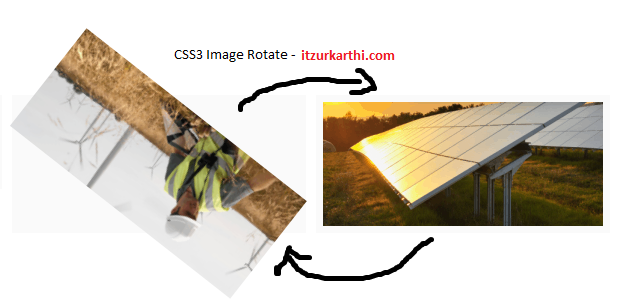
Few lines of CSS3 code is used to create a cool rotate / animate a image when a user mouseover it. I have used transition css3 code to made that effect.

CSS3 Code
img {
-webkit-transition: all 0.5s ease 0s;
-moz-transition: all 0.5s ease 0s;
-o-transition: all 0.5s ease 0s;
-ms-transition: all 0.5s ease 0s;
transition: all 0.5s ease 0s;
cursor:pointer;
}
img:hover {
-webkit-transform: rotate(360deg);
-moz-transform: rotate(360deg);
-ms-transform: rotate(360deg);
-o-transform: rotate(360deg);
transform: rotate(360deg);
}
We can customize the code inorder to rotate / animate image to 180 degree, 90 degree etc.
Please don’t forget to share and subscribe to latest updates of the blog. Also any comments and feedback are all welcome!
Thanks!

_oo