Today I am going to share some interesting stuffs. I had googled & come up with nice css framesworks that are really useful when its comes to responsive design.
Contents
Groundwork CSS

Built from the ground up with Sass, GroundworkCSS is a fully responsive framework that features an incredibly flexible, nest-able fluid grid system with support for any number of columns in any fractional amount, which means it is a framework that works for virtually any modern layout.
MUELLER Grid System
Based on Compass, MUELLER is a modular grid system for responsive/adaptive and non–responsive layouts. It gives you full control over column width, gutter width, baseline grid and media–queries.
Cool Kitten

The Cool Kitten framework, is a lightweight HTML/CSS/JS toolkit for creating a responsive parallax scrolling website. It makes use of Normalize.css, Stellar.js and the jQuery Easing Plugin.
Centurion
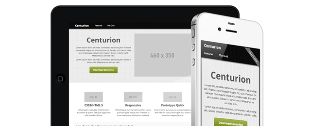
Built using SASS and CSS3 media queries, Centurion is an easy-to-use responsive web framework. It comes packages with custom and and easy to modify scripts for navigation, tables, and tabbed elements (built using CoffeeScript). Even the CSS was built using Sass making it easy to include or exclude any portions of the code you may or may not want
One% CSS Grid
One% CSS Grid is a percentage based 12 column fluid CSS grid system that would work perfectly well for anyone looking to quickly build a responsive base. It has two starting points, one which fits 1280px screens (in full screen view) and another one which fits 1024px screens (in full screen view).
Base Framework
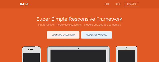
Base is a 12 column 960px grid (max) responsive CSS framework that has everything you need for starting a responsive web project quickly. It comes with a minimal HTML5 template (including jQuery), a stylesheet with basic styles, a default JS file with base enhancements & fallbacks and, a LESS file to easily customize your styleshee
Bourbon Neat
Neat is a semantic grid framework built on top of Sass and Bourbon. It is simple enough to get you up and running in minutes, and powerful enough to handle almost anything you throw at it. Using Sass 3.2 block mixins, this framework makes it extremely easy to build responsive layouts. Using the breakpoint() mixin, you can change the number of columns in the grid for each media query and store these values in project-wide variables to DRY up your code.
Gumby 2
Gumby 2 is a free, open-source responsive front-end development framework built with SASS. The grid is engineered to be there when you need it, and get out of your way when you don’t; it’s a powerful fluid-fixed layout defaulting to the popular 960 grid. It includes Google Webfonts, Entypo icons, modular scale typography and a fully customizable UI kit all built into it’s extensible codebase.
Foundation 4
Foundation, the popular web framework from ZURB, has recently undergone an intensive updgrade. The codebase has been completely rewritten with the objective of taking a ‘mobile-first’ approach. All of it’s JS plugins have all been rewritten to make them better, stronger and faster. And they’ve also switched Foundation over to Zepto, which is deemed a much lighter substitute for jQuery.
inuit.css v5.0
inuit.css is now (already!) at v5.0. However, this version doesn’t introduce much in the way of new features, it’s a lot more about how you use, implement and update the framework.
