Previously I had published Creating Responsive Images using CSS. & Responsive Design – display different contents for the different devices with CSS Now I am going to share some interesting resources which will help you to build responsive menu using css & jquery in your web projects / mobile projects.
Contents
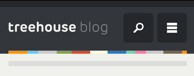
“Three Line” Drop-down Menu for a Responsive Website in jQuery

This tutorial shows you how to, with a relatively short amount of code, progressively enhance a responsive site and build a “three line” responsive menu without adding additional markup to the page. All additional markup will be included dynamically using jQuery.

In this approach to responsive navigation, we’re going to use an approach that can accommodate large, multi-level navigation menus using media queries and jQuery, whilst trying to keep our markup simple and our external resources minimal.

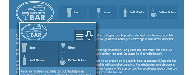
With this tutorial, you will be shown a very simple approach for building a responsive menu from the ground up using CSS3 media queries and a little jQuery to display the menu on a smaller mobile screen.
Simple Responsive Navigation Demo
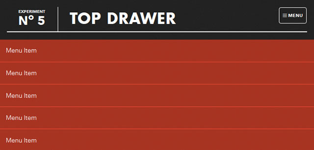
Smooth Responsive Dropdown Menu –(CSS & jQuery)

This tutorial demonstrates how to create a smoother reveal mobile menu using CSS3 rather than animating it with JavaScript. Once you click the menu icon, the click event will assign the class of active to the drawer container which alters the translate value to bring the drop-down menu nice and smoothly into view.
Modernizr will detect whether the user’s device is capable of CSS transforms, if it isn’t the menu will simply show and hide the menu after the button is pressed.
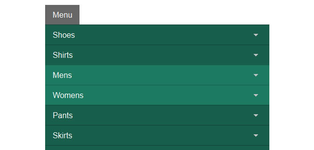
CSS3 Responsive Menu (CSS-only)

This tutorial offers a step by step instructions to building a responsive navigation menu that adapts to varying screen sizes (in a block-style), using media queries.
